
Vertical in Sloterdijk living on layered terraces
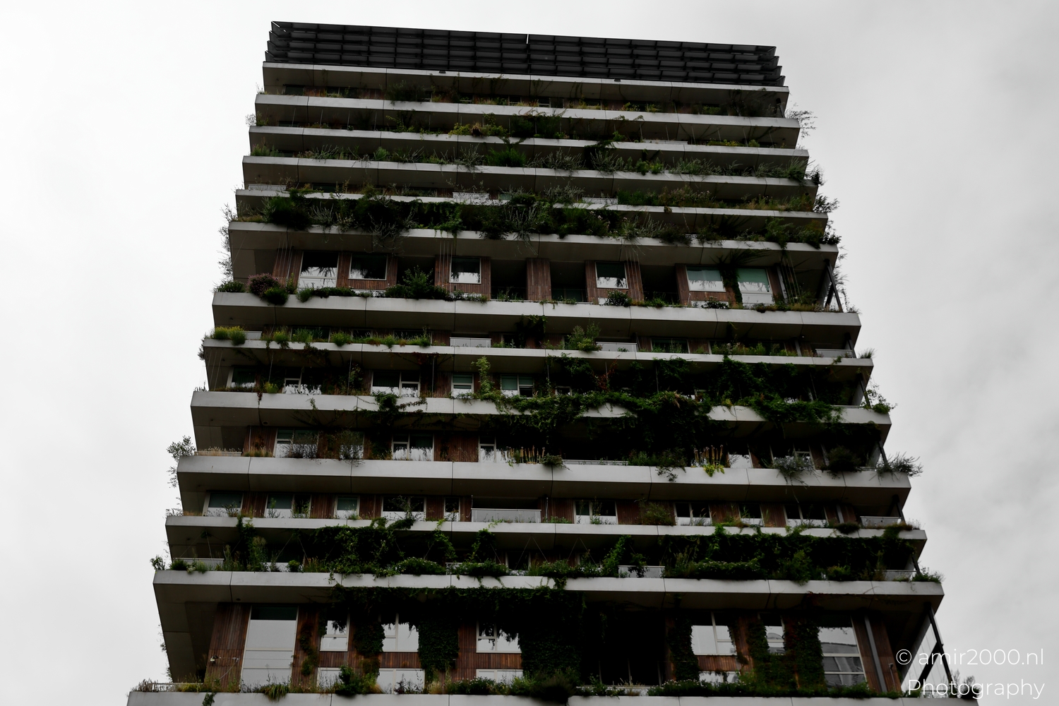
In Sloterdijk Amsterdam this tower stacks homes like terraces in the sky.
Concrete edges trace clean lines while wood panels and plants soften the frame and invite the eye closer.
From street level it feels calm and lived in rather than a display piece for a brochure.
It reads as homes first and an object second, which suits a district that mixes rail, bikes, and daily errands.
Balconies carry herbs and small trees and you can sense breakfast tables and evening lamps behind the glass.
Circulation is tucked away so the facade reads like layers of outdoor rooms that trade shade and sun across the day.
The green is not decoration but a set of small habitats that change with wind, rain, and season.
I walked slow to watch how light slides under the slabs and catches on the timber rails as clouds move overhead.
This is an architecture photo study of Vertical in Amsterdam Sloterdijk made with the Canon EOS R5 Mark II.
The aim is to show the system that makes comfort possible rather than a single hero angle that says little about life.
Exposure: 1/250 sec | ISO: 125 | Aperture: f/7.1 | Focal Length: 45 mm | © amir2000.nl
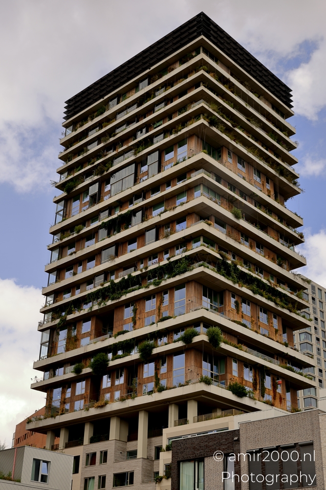
I started with a wider look to read the rhythm of the floors and the way mass sets back in steps.
Each level holds small gardens that break the geometry just enough to feel human without losing order.
Light slips between the slabs and picks up the grain of the wood so the warmth reads against cool concrete.
Setbacks create a gentle stair that makes the tower feel less severe from the street and easier to live with day to day.
Laundry lines, planter boxes, and a chair left at an angle turn repetition into a lived pattern across the grid.
From here you can see how the building meets the ground with shops and entries that stay open to the public way.
The plaza feels like a front yard rather than a moat, which keeps passersby and residents in quiet contact.
I kept the lens choice honest so distance remains legible and scale does not collapse into a billboard view.
The frame describes a building that performs work for people and not simply a silhouette against an empty sky.
Even overcast fits the mood, because the architecture relies on proportion and texture rather than sparkle.
Exposure: 1/250 sec | ISO: 125 | Aperture: f/7.1 | Focal Length: 50 mm | © amir2000.nl
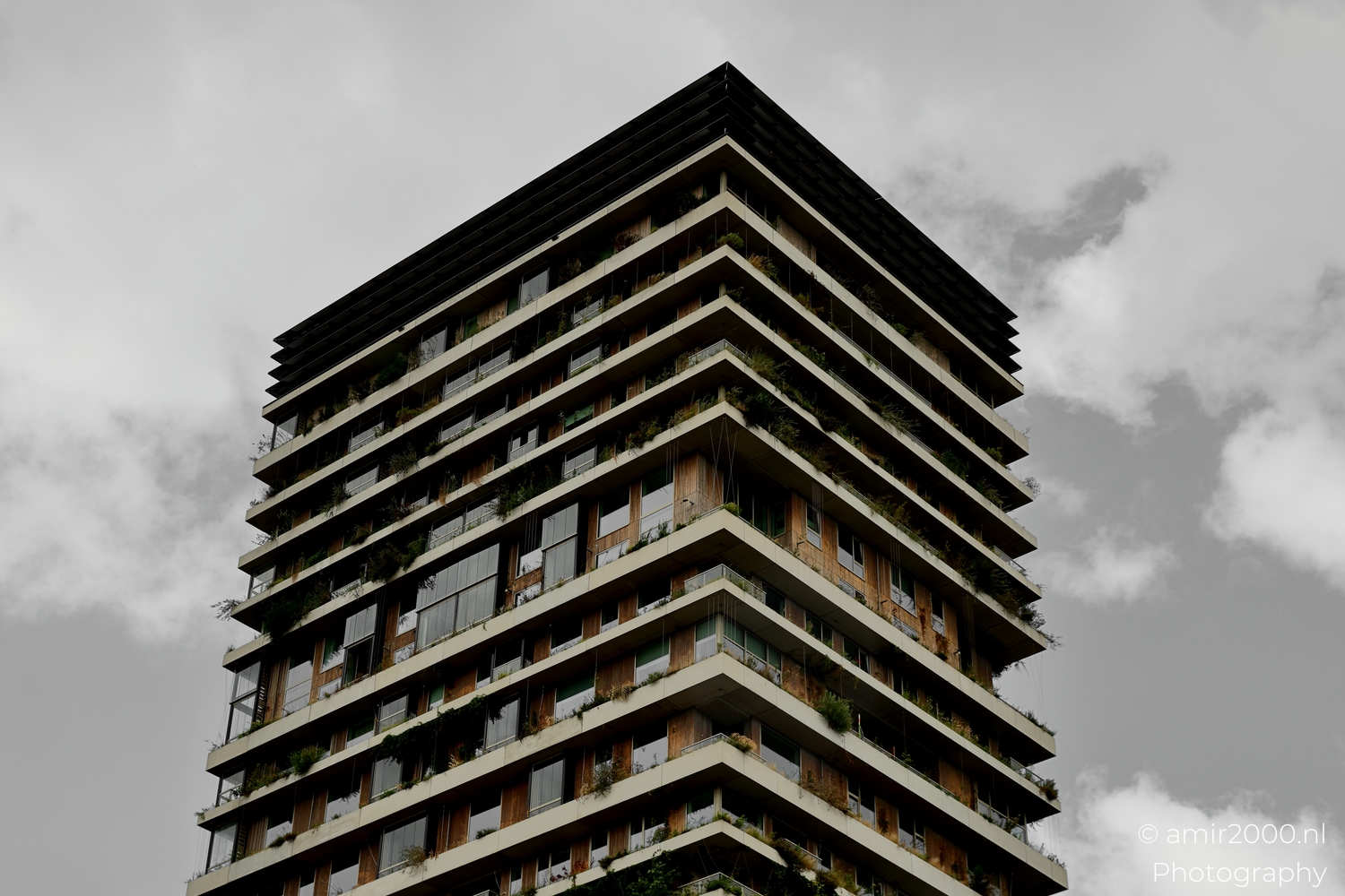
Closer in the corners tell the story of how planting and structure cooperate rather than compete.
Planters lean over the edge while thin cables guide climbers down the facade and soften the vertical drop.
You can trace how the building collects wind, sun, and shade and serves them in different doses during the day.
It is simple and clever at the same time, because the same steel that guards edges also carries vines and lights.
Timber warms the concrete and the fine steel lines keep everything crisp and tidy so maintenance remains realistic.
From this angle rails align from floor to floor and prove that the grid stays calm even with many plants in play.
Drainage cuts are visible if you look, which matters in a climate that asks for patience with weather.
I framed to keep the lines square so the viewer can read how parts meet and how tolerances are respected.
The detail picture explains comfort, because shade, privacy, and view are built rather than left to chance.
That is the real luxury here, a steady background that lets daily life be easy and unhurried on a high balcony.
Exposure: 1/400 sec | ISO: 125 | Aperture: f/6.3 | Focal Length: 41 mm | © amir2000.nl
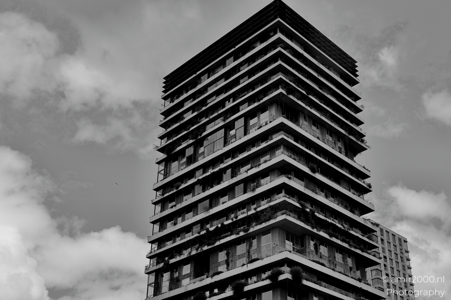
A black and white frame strips the set back to line and proportion and tests whether the idea still holds.
Without color the stacked bands float against the sky and the structure reads like a clear drawing on a clean page.
It shows how the green is placed within a disciplined grid rather than hiding it behind a screen of leaves.
Shadows pull a steady tempo and the plant clusters read as soft punctuation marks inside the measured beat.
This view makes the massing legible and turns texture into tone so the eye can check balance without distraction.
I held exposure a touch for the highlights to keep the sky present while protecting edge detail on the timber rails.
Any flourish that does not serve comfort falls away here, which is why the result feels confident rather than loud.
The picture is a reminder that good housing can be generous and exact at the same time when the frame is honest.
It also links the tower to the larger neighborhood language of clean edges and working materials used well.
The drawing quality invites return visits in different weather, each time testing how the shapes carry mood.
Exposure: 1/400 sec | ISO: 125 | Aperture: f/6.3 | Focal Length: 53 mm | © amir2000.nl
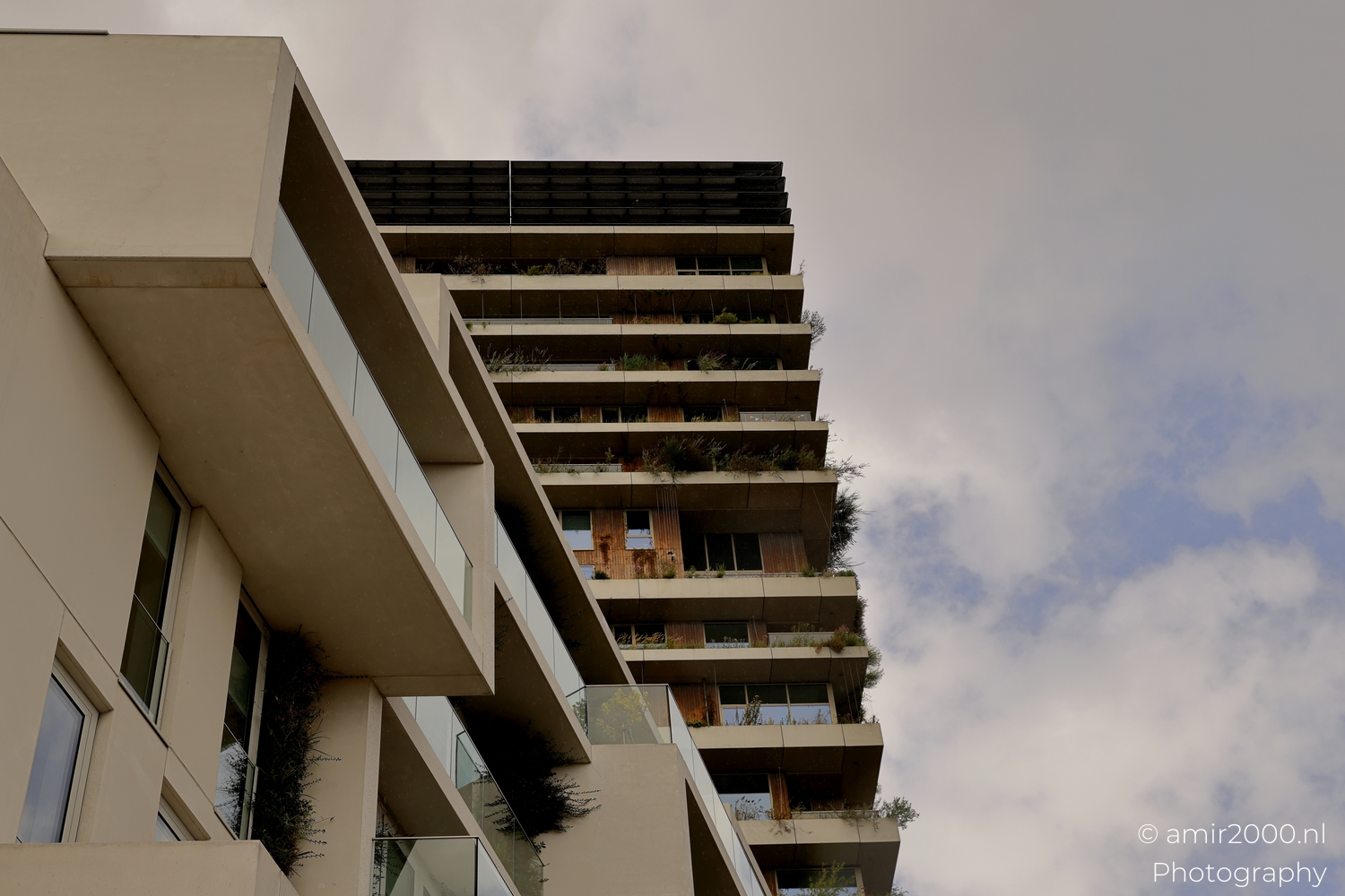
From the lower terraces you feel the scale of the balconies and the warmth of the materials at hand height.
Glass rails keep views open while shrubs and small trees add a soft edge that filters wind without sealing life away.
Paving changes underfoot and small lamps tuck into planters like markers on a path from door to corner seat.
Conversations drift across levels so the facade sounds like a neighborhood rather than a wall of private cells.
I watched how a resident watered herbs and how runoff followed tiny rills to a drain cut concealed in the slab.
Details like that explain durability and make the green believable in a rainy city that still wants sunlight when it comes.
Here the camera stays at eye height because this is a place to stand and talk, not a diagram to admire from afar.
Texture becomes the subject and the hand can imagine the grain of the rail and the cool of the glass on a bright day.
The tower is tall, yet these corners keep it kind and leave room for small moments that matter more than skyline shots.
This is where the idea of living with plants becomes a practice and not a promise that fades after a ribbon is cut.
Exposure: 1/1250 sec | ISO: 160 | Aperture: f/5.0 | Focal Length: 42 mm | © amir2000.nl
Evening settles and soft reflections run along the glass while planters hold the last warmth of the day.
You hear cutlery in a cup and a chair moved a few centimeters so two people can share the view.
Light behind the curtains turns the timber into a gentle copper and makes the shrubs read as silhouettes.
I lifted the frame slightly to keep horizon lines clean and to let the terrace edge pull the eye into the scene.
The picture closes the walk by returning to human scale and to the reason the system exists at all.
Good architecture gives comfort and choice and you can feel both here without a caption or a plan at the side.
For more city form studies and balanced living spaces, explore the Architecture Photography category on the blog.
Browse longer sequences and related angles in the Architecture gallery to trace how Sloterdijk evolves through careful detail.
Amir
Photographer, Builder, Dreamer
amir2000.nl
Comments
No comments yet. Be the first to comment!